Blade App
Overview
Golfers don’t know what to expect when traveling to a new golf course. This app would provide traveling golfers with a breakdown of what to expect on a new course from playing conditions to amenities offered. I conducted user interviews and testing to arrive at a solution. The objective was to create a mobile app with all the information a traveling golfer needs to play any course like a local.
This project was created as part of my coursework at General Assembly.
Role
UX/UI
User Research
User interviews uncovered frustrations with surprise regulations and maintenance that altered their golf experience upon arriving at a course. Some players griped about having to play a longer round behind a slow group or league.
Aside from a good scope of the course layout players wanted to know about the amenities and enjoyed the idea of knowing that a course would have GPS enabled electric golf carts vs. gas powered carts.
Ideal User
The ideal user was the informed explorer, the competitive player, and the experience value conscious golfer. Their satisfaction on a golf trip is ensured by being well prepared for the adventure to come.
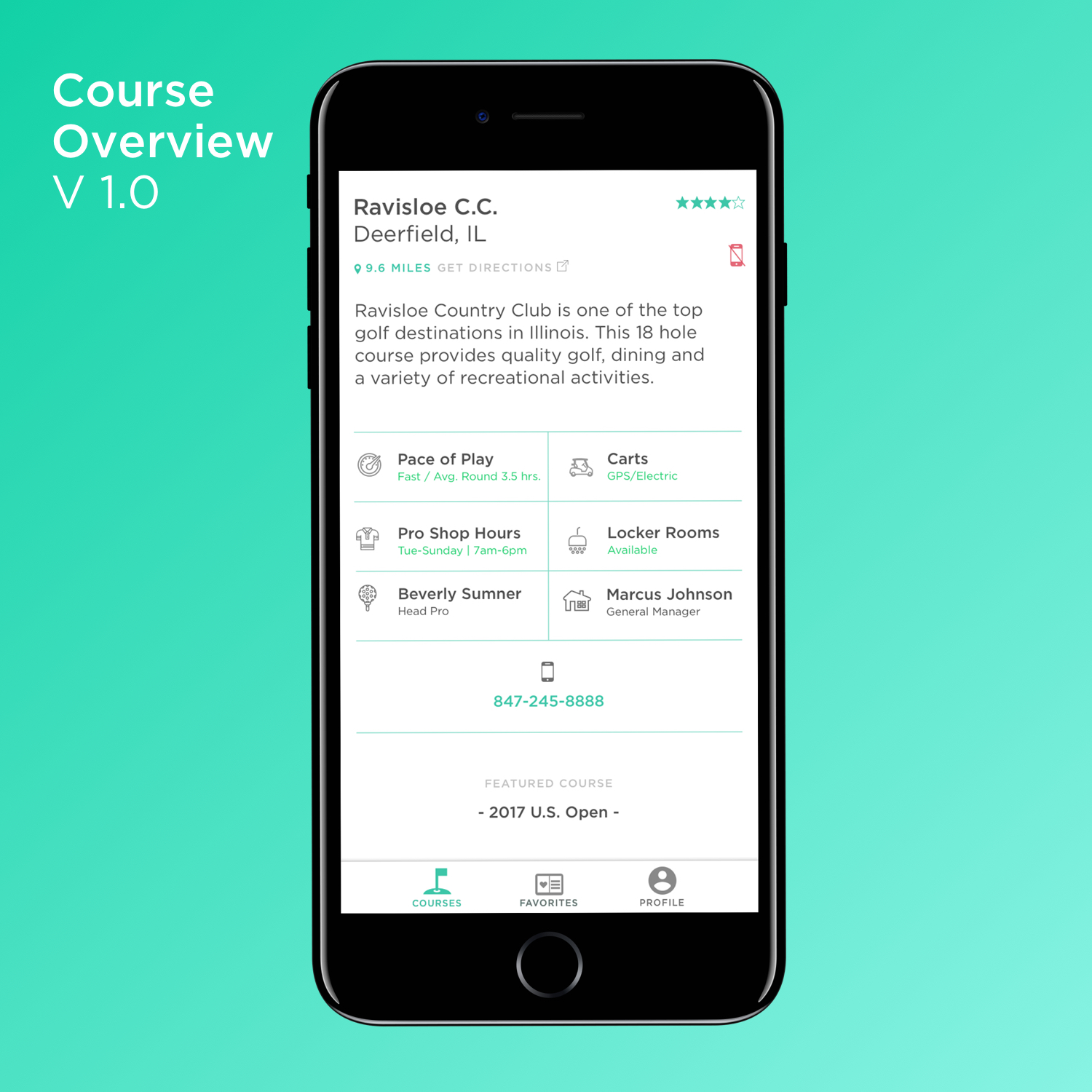
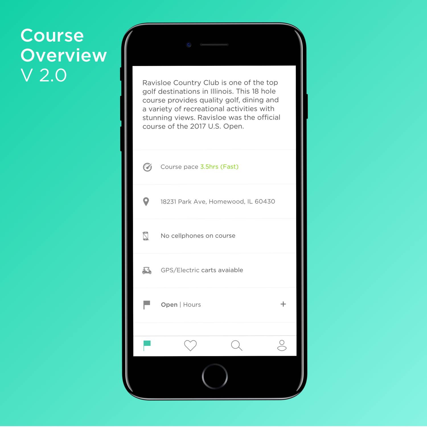
The ideal user will benefit from an app that informed them about pace of play, locker room availability, the type of golf carts on hand, and warnings of any rules or restrictions.
User Flows
& Wireframes
I took into account where our user would be while using the app and knowing that our ideal user was fast paced the user flow needed to be quick and simple.
Three main user flows were designed to access information quickly on and off the course.
The Design
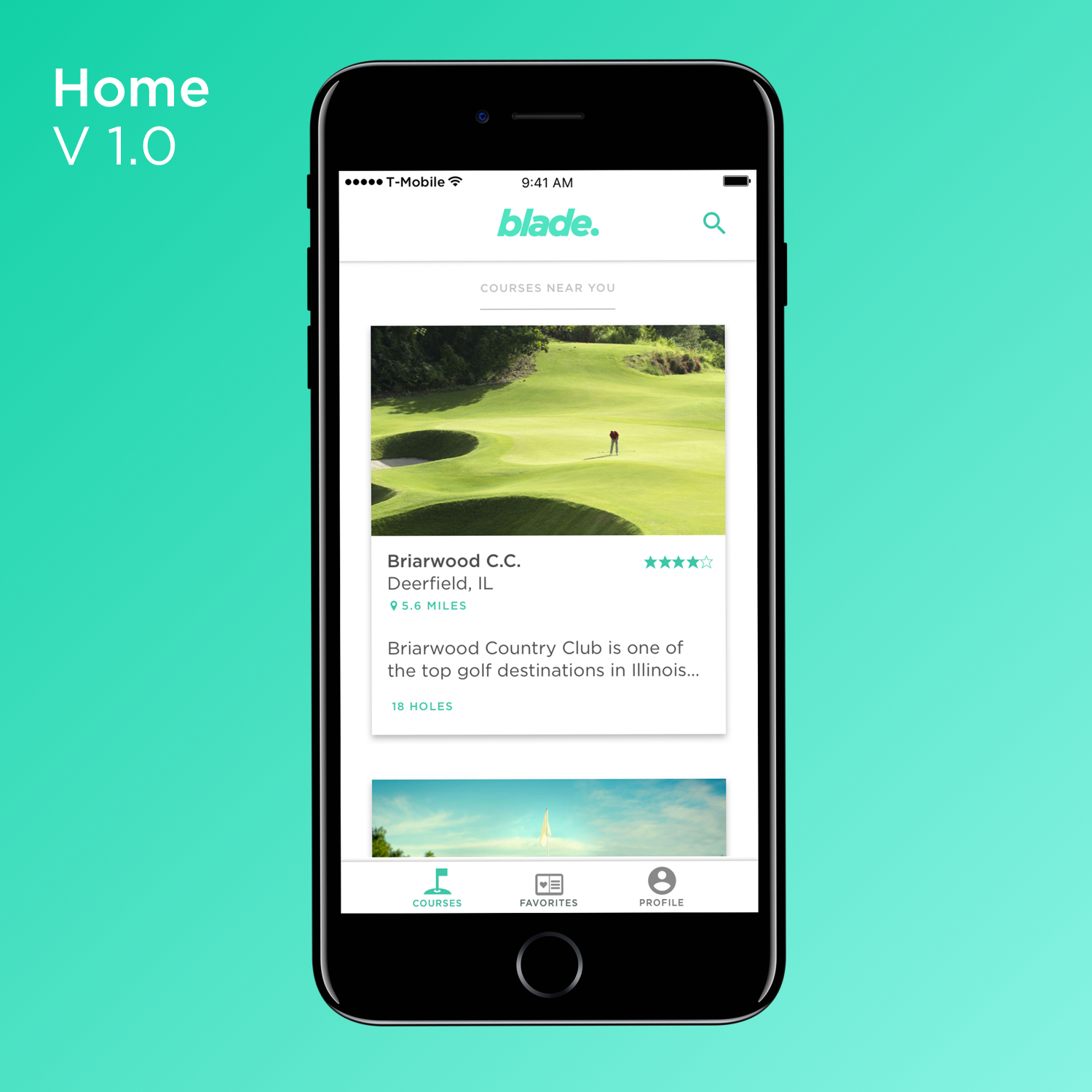
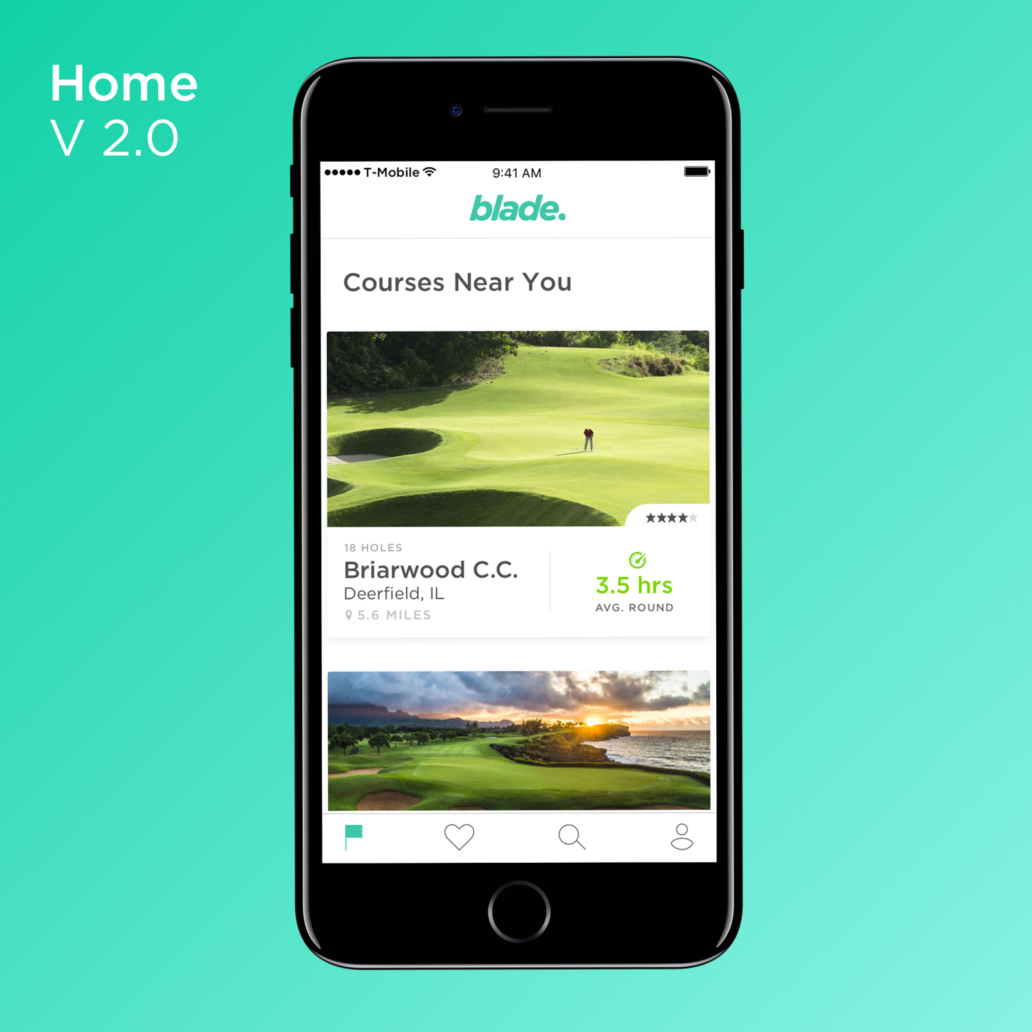
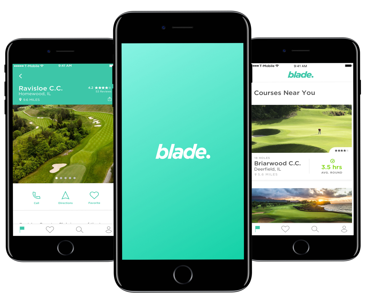
I employed high contrast to ensure our user could easily read the information on a sunny course. The app is designed to be location-based and the most important information to our user is front and center.
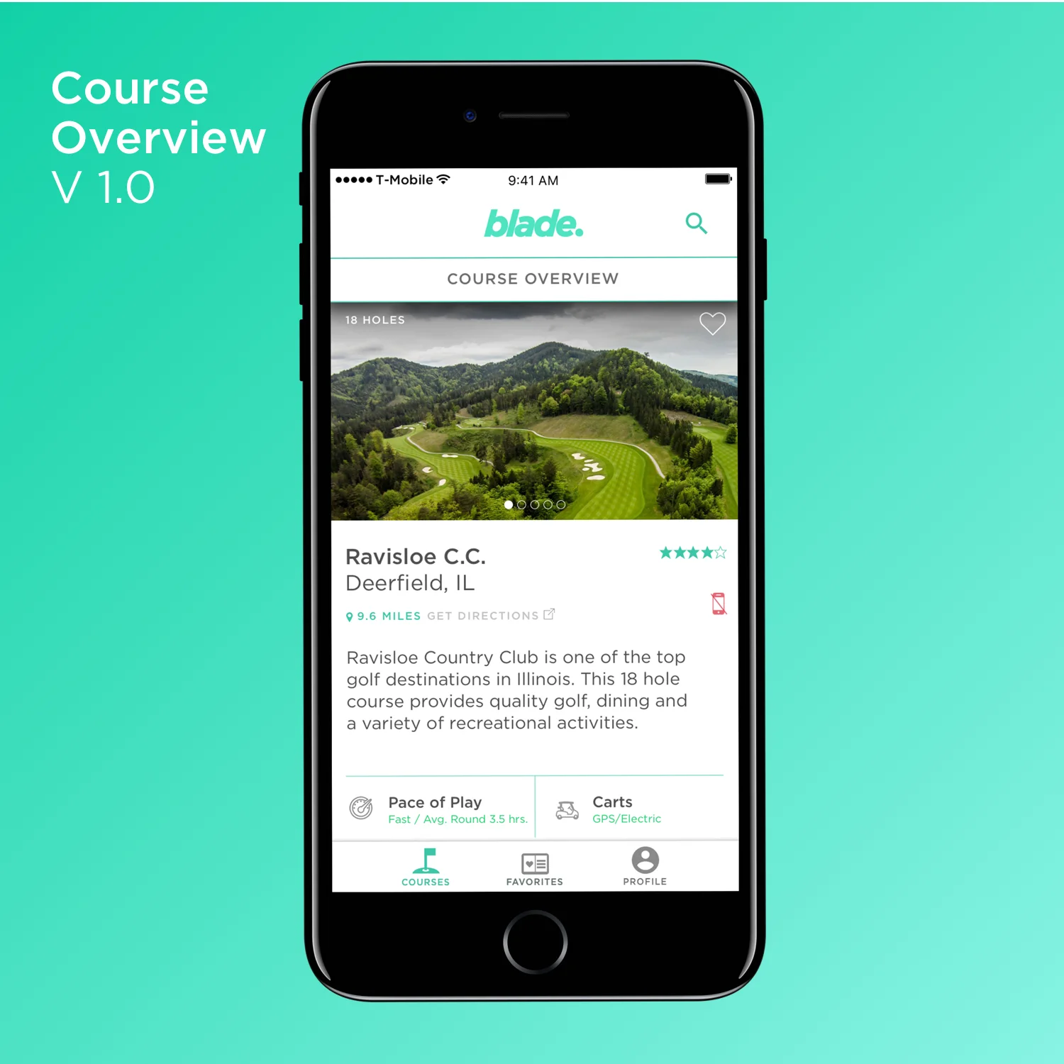
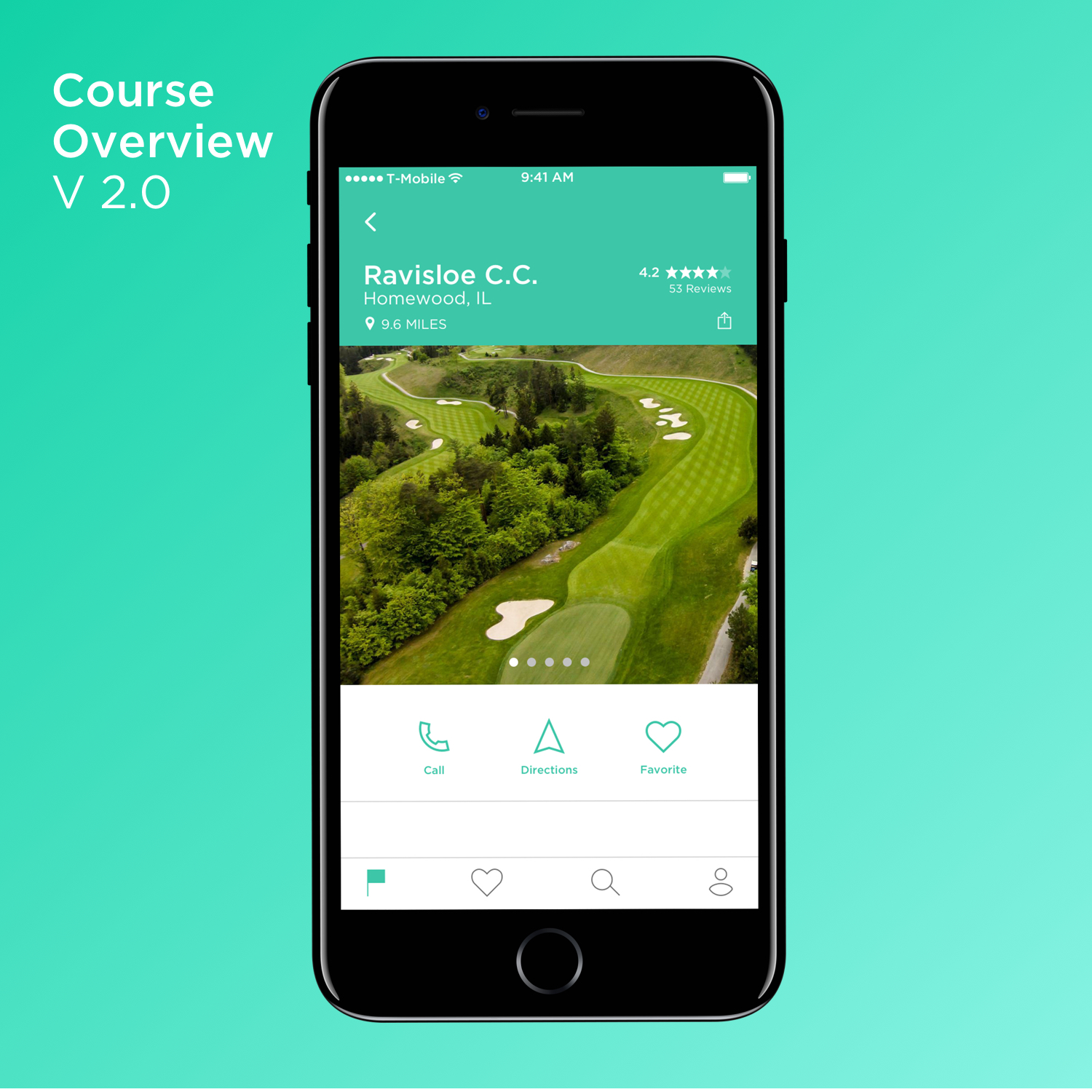
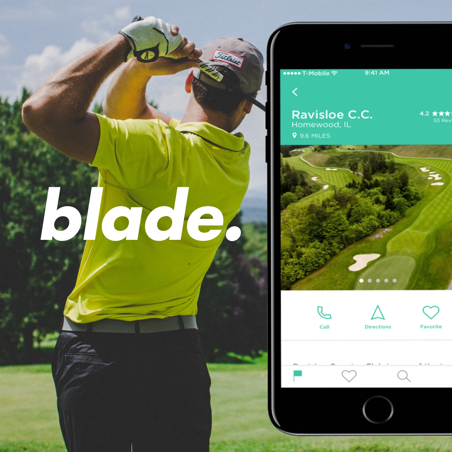
Live average pace of play, ratings, and distance to courses are readably available upon reaching the home page. The course overview showcases pictures, quick action menu, and reviews. Each course overview has access to information about the holes on a course.
The Details
Individual hole pages provide layouts, yardage, fairway information and possible course restrictions. A quick look at the green's speed and the slope is also available.
The ability to favorite a course is available to allow the user quick access to past courses.
Personalized Experience
The app allows our user to keep track of scores, duration, notes, and photos from past outings. A feature of a Member Discount Code would allow our users to benefit from deals and perks from pro shops across the United States.
User Testing & Iteration
Through user testing and critique from other designers, changes were made to the UI. Icons for the menu were simplified and the UI in whole was freed of unnecessary or overused elements such as lines and colors.
